[section separator="true"]
[section-item 9]
[row]
[column 12]
[toc-this]
Principles
We use charts in our reports to show an explicit message. Charts allow the reader to see the numbers, trends, patterns, relationships and exceptions in the data. If we are unsure of what the numbers mean (no trend or exception emerges), then we should re-consider the use of the chart and perhaps use a simple table instead. The main advantage of charts is that they are perceived by the visual system of our mind, which is much faster than the verbal system, which processes text and tables
Charts should be self-explanatory, that is you should not need to read the report to understand them.
Instructions
Chart choice
To be successful in communicating with charts, you have to choose a chart type suited to the message. You should organise the display or illustration so that the point is obvious. Do not over-complicate matters by attempting to show two or more disparate messages. Avoid overloading the chart with data and variables.
Use the simplest style of charts available. Simple bar charts communicate more easily than component bar charts. Simple line charts are more accessible than layered line charts. Visual perception is quite good in comparing lengths, following lines and detecting patters in two dimensions. Visual perception is not so good in comparing areas and colours.
The possible messages can be associated to data relationships: how something changes with time (time series), how to items change together (correlation), which items are bigger (ranking)… Some chart types are better in showing some data and relationships, so there is almost a chart type for each kind of message.
|
Message
|
Best choice
|
Alternatives
|
|
Changes over time
|
Time series chart conveys the connection between data points. A minimum of 3 points is needed to show a pattern. Limit the chart to five lines.
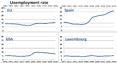
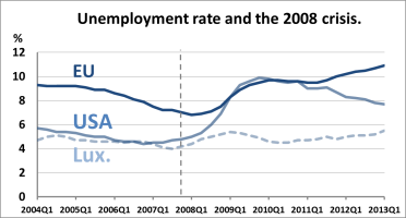 As more lines become indecipherable, use multiple small time series charts.
|
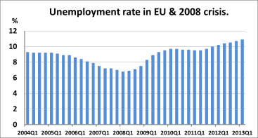
For a single series, vertical bars are possible; however, bar charts are better for non-continuous data.
|
Ranking
Comparisons
Note: always sort values.
|
Bar chart allows quick comparison between large amounts of data.

|
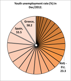
Pie chart is possible and can be visually appealing. However, avoid with many components or similar values, because it is difficult to compare the items. It is very difficult to compare data across two or more pie charts.
Avoid this!
|
|
Part to whole
|
Bar chart
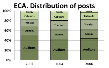
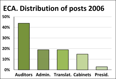 Use stacked bar chart, if several series.
|
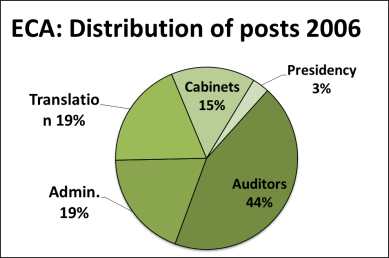
Pie chart is possible for a small number of items, which are not of similar size.
|
|
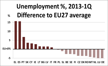
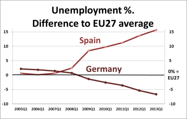
Deviation from a single value(e.g. average)
|
Bar char showing the difference from the given value
|
|
|
Deviation from a trend over time
|
Time series chart
Plot the differences and draw the reference line.
|
|
|
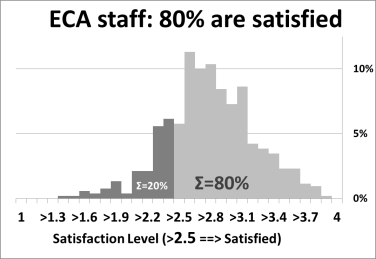
Distribution
|
Histogram summarises vast amounts of data that fall into numeric ranges or categories.
|
Box plot is good for comparison several distributions
 Line histogram can be used to show the shape of distribution.

|
|
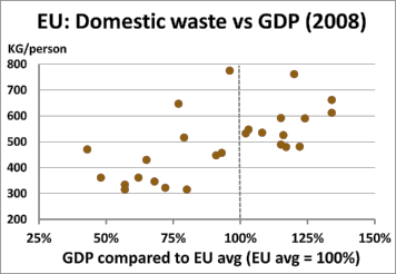
Relationship between variables
(Correlation)
|
Scatterplot reveals relationship by displaying a number of points.
|
|
There are many further chart types available. More complex charts should be used cautiously. If you would like to use a complex chart, consider: what is the message? Does the chart convey that message? Is there a simpler method of getting that message across? It may be preferable to use several simple charts to convey the message than to use a single complicated chart.
[toggles]
[toggle title="Strengths%20and%20weaknesses%20of%20selected%20complex%20charts"]
|
Chart type
|
Strengths
|
Weaknesses
|
|
Paired bar chart
|
Allows for two way or grouped comparisons. Paired bars are more effective than stacked bars.
|
|
|
Component bar
|
Provides comparisons and cumulative totals.
|
Subject to distortion and misinterpretation. Cumulative data can be difficult to compare. Such charts often fail to make an impact.
|
|
100% stacked
|
Provides unit comparisons and totals.
|
Overloads readers with unimportant data. Rarely vivid or memorable. Subject to distortion and misinterpretation.
|
|
Layered line
|
Tries to supply relative and total comparisons.
|
Volume comparisons are subject to distortion. Overloads readers with unimportant data.
|
|
Histogram
|
Measures frequency by summarising vast amounts of data that fall into numeric ranges or categories.
|
Easily misinterpreted; Readers are likely to be unfamiliar with them.
|
|
Scatterplot
|
Reveals relationship by displaying a number of points.
|
Readers may find them overwhelming. Users may not be familiar with them. Message is often lost.
|
|
Back to back
|
Compares positive and negative data. Vivid if kept simple.
|
Comparative data are separate, leading to confusion and lessening impact.
|
|
Multi-column bars
|
Shows breadth of data. Useful in preliminary stage for categorising items.
|
Most readers are unfamiliar with these. Categories may be unclear.
|
|
Spider-chart
|
Shows performance and compares different aspects of performance.
|
Too complex for the average reader. Demands comparison of items in a circle.
|
|
Super-imposed chart
|
Allows comparison of two different sets of data.
|
Confusing to many readers. People often misread the scales and misinterpret the information. Ensure that comparisons are valid.
|
|
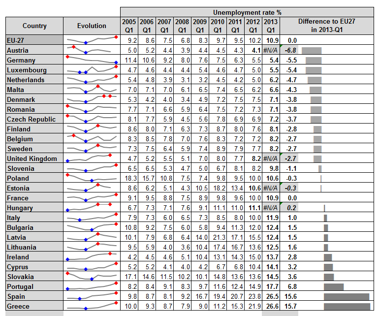
Spark lines and in-cell charts
|
Allow combining tables with small charts incorporated within the table.
|
|
[/toggle]
[/toggles]
General design tips
After having chosen the chart type that helps perceive the message, each element of the chart (title, axes, labels…) should help to tell the story clearly and no useless element should remain, i.e. without nothing missing and nothing extra obscuring it.
The following tips should help you to keep the design simple, yet effective.
Do not follow them without thinking. Try variations and see which one makes your chart better.
Integrate text and the chart
Keep the chart on the same page as the text. State your message in the text and mention that this is also shown in a chart. For example, "We found that cows are 25% happier today that 10 years ago (see Figure 1) … Figure 1 - Evolution of cows’ happiness" Write your text while looking at the chart. Avoid sending the chart to an appendix.
Colours
Do not depend on the use of colour for interpreting facts. Design your charts using shades of one colour (grey or other colour). If you need more colours because 5 shades are not enough, there may be too many things in one chart. Add more colours only if they add information (example: green=ok, red=alert) and do not clutter the chart. Several hues of one colour are usually a good choice. Prefer soft colours in general and strong ones only to highlight exceptions. Respect the colour palette provided in the ECA visual identity guideline. Finally, print the chart in black and white to check that it will be ok for people with colour blindness or if not printed in colour.
Title
Charts must have a title. The title can explain and reinforce the message ("Unemployment descending in Spain") or only say what data is charted ("Unemployment in Spain 2005-2013") or both things.
Axes
- Axes should be labelled at least with the units used (€, m2, %), optionally with the full description and units like: 'Oil price ($/barrel)'.
- Remove decimals (e.g. 10.00 to 10) and reduce the number of digits by using the large numbers names (e.g. 10 000 000 to 10 million)
- Place the axes near to the data (near the longest bar) or the most important data (the most recent value in a time series). The same axis can repeat on both sides.
- For bars the axis must start at zero. Otherwise we show only the tips of the bars and not the data (= length of bar).
- Do not use 2 vertical axes with different scales. It is very confusing. Either use only one scale, or separate in two charts or convert into percentages of change.
Text within the chart
Text within the chart should be large enough to read, and presented horizontally. Try to write the names the series on the chart. If it does not look good then use a colour-coded identification with a legend. Avoid data labels: if readers need to know the values, give them a good table rather than a cluttered chart. Avoid unfamiliar abbreviations.
Non-data ink
’Data ink’ are the components representing the data (lines, bars or dots) and ’non data ink’ are the rest. Non-data ink should be kept only if it contains useful information (titles, axes, legends, reference lines, important grids) and if it does not obscure the chart. Similarly, avoid any superfluous decoration (e.g. cluttered backgrounds, gridlines, multiple fonts, borders, bold and underlines), unusual formats or special effects such as 3-dimensional graphics.
Alignment of charts in the report
It is important that charts within the same report be presented in a consistent and comparable manner.
Showing accurate data
If there is a need to show accurately more data than is possible in a chart, consider the following possibilities:
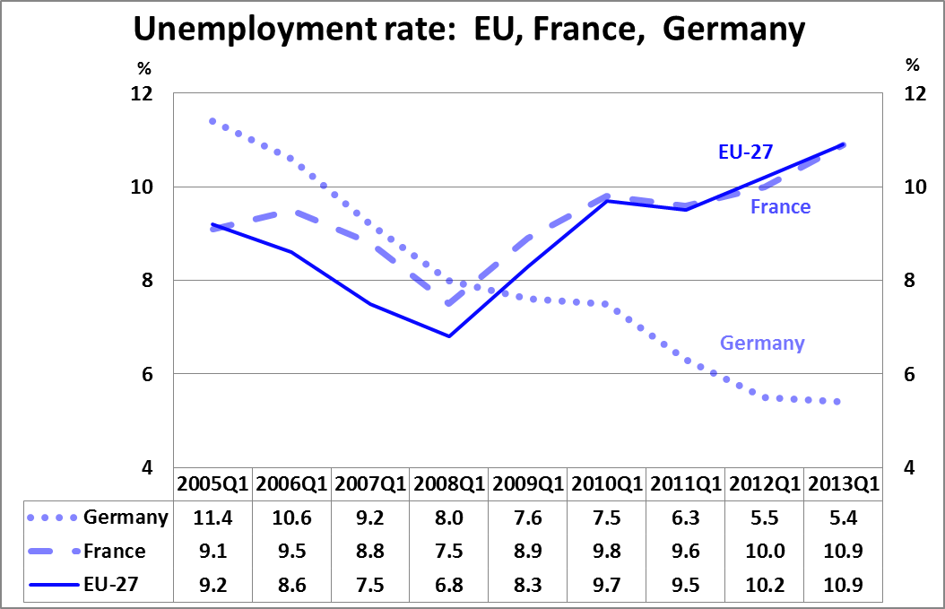
- Use a chart with your message inside the main text and include a table with the complete data in an appendix.
- Add a data table to a chart
[toggles]
[toggle title="Example"]
[/toggle]
[/toggles]
- Use a table enhanced by in-cell/in-line charts.
[toggles]
[toggle title="Example"]
[/toggle]
[/toggles]
Design tips for specific chart types
Bar chart: Arrange bars in size or logical order. Broaden bars for greater impact. Vertical and horizontal bar charts are equally easy to understand, but horizontal charts are easier to label, and readers expect money and time to be vertical. In a paired bar chart, ensure grouping highlights your message.
Pie chart: Limit the number of slices, ideally five. Arrange slices in order, largest to smallest, starting at 12 o'clock. Label slices individually, do not use a key legend. Include the overall volume or quantity in the title.
Histogram: Succinct explanation and simple design are essential. Make sure that readers know what the histogram represents by including the chart's message in the title. Ensure axis labels are clear and coherent. Choose between 5 and 20 categories - fewer than 5 gives no discernible pattern, more than 20 is unwieldy. Histograms are drawn vertically rather than horizontally.
Scatterplot: Readers may not know how to interpret, so include an explanation of its conclusion. Label scales carefully. Trend lines are optional.
Small multiple charts: Use same scale on all charts and consider adding the average (reference level) to all charts.
Resources
[icons-list icon-size="2" separator="line" icon-vertical-alignment="middle" vertical-alignment="middle"]
[icon-list-item title="Case%20study%3A%20From%20message%20to%20chart" description="includes%20two%20examples%20describing%20the%20process%20of%20chosing%20the%20chart%20suitable%20to%20the%20message%20and%20designing%20the%20chart%20to%20convey%20the%20message%20most%20effectively." link="%2Faware%2FDocuments%2FCharts-case-study-examples.docx" icon="file-word-o" /]
[icon-list-item title="ColorBrewer" description="This%20tool%20than%20can%20help%20you%20choosing%20colours." link="http%3A%2F%2Fcolorbrewer2.org%2F" icon="external-link" linking="new-window" /]
[icon-list-item title="FT.com%20visual%20vocabulary" description="can%20be%20used%20as%20a%20starting%20point%20for%20finding%20the%20type%20of%20chart%20most%20suited%20to%20the%20message%20you%20want%20to%20convey%20with%20the%20data" link="https%3A%2F%2Fft-interactive.github.io%2Fvisual-vocabulary%2F" icon="external-link" linking="new-window" /]
[icon-list-item title="FT.com%20visual%20vocabulary" description="same%20as%20above%20but%20in%20the%20PDF%20format" link="https%3A%2F%2Fgithub.com%2Fft-interactive%2Fchart-doctor%2Fraw%2Fmaster%2Fvisual-vocabulary%2FVisual-vocabulary.pdf" icon="file-pdf-o" linking="new-window" /]
[/icons-list]
References
Blogs
[link new-window title="Jon%E2%80%99s%20Excel%20charts%20and%20tutorials" link="http%3A%2F%2Fpeltiertech.com%2FExcel%2FCharts%2FChartIndex.html" icon="external-link" /]
[link new-window title="Become%20Awesome%20in%20Excel%20and%20Power%20BI" link="http%3A%2F%2Fchandoo.org%2Fwp%2F" icon="external-link" /]
[link new-window title="Junkcharts%20by%20Kaiser%20Fung" link="http%3A%2F%2Fjunkcharts.typepad.com%2Fjunk_charts%2F" icon="external-link" /]
, a cult blog on charts.
Books and articles
- Classic Book:
[link new-window title="How%20to%20lie%20with%20statistics" link="http%3A%2F%2Fwww.amazon.com%2Fdp%2F0393310728%2F" icon="external-link" /]
, Darrell Huff 1954, ISBN-13: 978-0393310726;
- Modern Book:
[link new-window title="Show%20me%20the%20numbers%3A%20Designing%20Tables%20and%20Graphs%20to%20Enlighten" link="http%3A%2F%2Fwww.amazon.com%2Fgp%2Fproduct%2F0970601972" icon="external-link" /]
, Stephen Few 2012. ISBN-13: 978-0970601971.This abstract from a course is [link new-window title="available%20on%20the%20net" link="http%3A%2F%2Fcourses.washington.edu%2Finfo424%2F2007%2Freadings%2FShow_Me_the_Numbers_v2.pdf" icon="external-link" /]
;
- Article:
[link new-window title="Ten%20Chart%20Design%20Principles" link="http%3A%2F%2Fpeltiertech.com%2FWordPress%2Ften-chart-design-principles-guest-post%2F" icon="external-link" /]
, Mike Alexander;
- Article:
[link new-window title="Save%20the%20Pies%20for%20Dessert" link="http%3A%2F%2Fwww.perceptualedge.com%2Farticles%2F08-21-07.pdf" icon="external-link" /]
, Stephen Few, 2007;
- Article:
[link new-window title="Understanding%20Pie%20Charts" link="http%3A%2F%2Feagereyes.org%2Ftechniques%2Fpie-charts" icon="external-link" /]
, Robert Kosara, 2010;
- Article:
[link new-window title="Better%20Know%20a%20Visualization%3A%20Small%20Multiples" link="http%3A%2F%2Fwww.juiceanalytics.com%2Fwriting%2Fbetter-know-visualization-small-multiples%2F" icon="external-link" /]
, Zach Gemignani, 2010;
- Article:
[link new-window title="Practical%20Rules%20for%20Using%20Color%20in%20Charts" link="http%3A%2F%2Fwww.perceptualedge.com%2Farticles%2Fvisual_business_intelligence%2Frules_for_using_color.pdf" icon="external-link" /]
, Stephen Few, 2008;
- Article:
[link new-window title="Choosing%20Colors%20for%20Data%20Visualization" link="http%3A%2F%2Fwww.perceptualedge.com%2Farticles%2Fb-eye%2Fchoosing_colors.pdf" icon="external-link" /]
, Maureen Stone, 2006.
[/toc-this]
[/column]
[/row]
[/section-item]
[section-item 3]
[row]
[column 12]
[toc fixed="true" selectors="h2%2Ch3" class="basic-toc" /]
[/column]
[/row]
[/section-item]
[/section]